The focus group
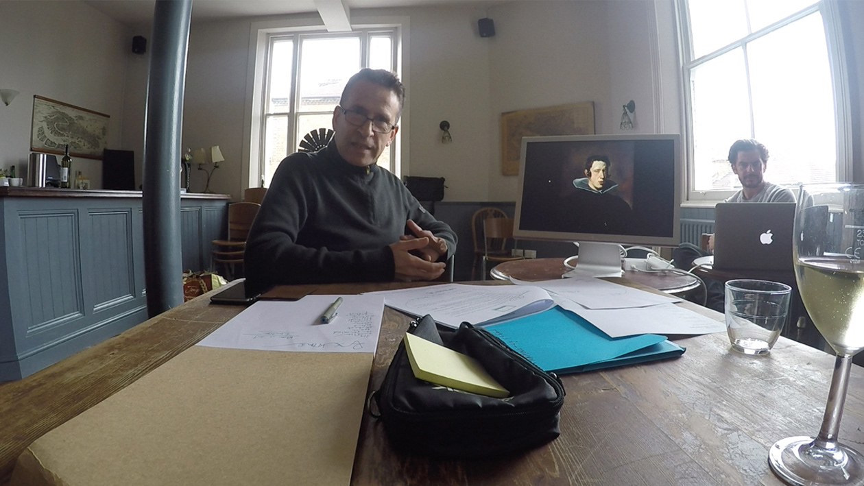
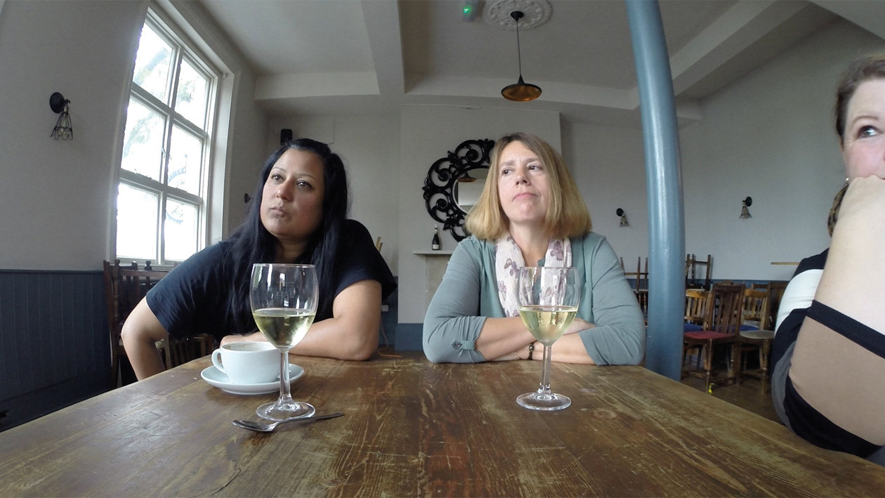
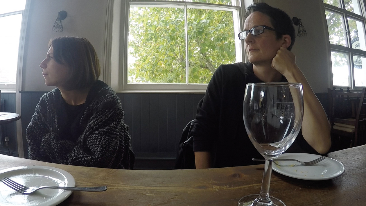
As part of my practice I started to apply advertising processes to my art. The focus group is a way of determinig the strength of an idea or a product during its development to maximise its effectiveness. I was intrigued to see its effect on both my work but also how it might 'improve' some great work from established artists. As within the advertising process I took verbatims and themes from the groups feedback and applied them to some of The Greats.
The first group were 6 women from the Lewisham area - Leslie, Lorraine, Julie, Katrin, Claire & Anna.
Session mediator - Mark Radcliffe
Recruitment - Lamis Harper


The works:
1. J. Constable 2. M. Rothko 3. D. Day 4. D. Velasquez 5. D. Day 6. A. Warhol 7. J. Deller 8. D. Day 9. G. Wearing 10. D. Day 11. B. Nauman
A range of works were shown from classical, modernist, conceptual and a mix of some of my pieces.
Below is the development of Diego Velazquez's Prince Philip IV. Three phases, the original, the marked up retouching notes for the retoucher based on focus group feedback and the final output.
Transcript excerpt from Diego Velasquez 'Philip IV'
He doesn’t look attractive does he? That hairstyle.
I don’t think it’s very attractive as a visual, you have to be interested in the person.
Flemmish.
I think it’s really interesting to see portraits because there’s no photographs of that time. It’s history. Even not knowing the story it’s quite interesting to know that people had similar features to us today.
It does look like somebody today, you just have to change that hairstyle
Timeless in that sense
I like the way he’s emerging from the shadow. The light is interesting.
It is quirky, he’s a funny looking chap.
His body looks huge.
It’s unsettling – because of the extreme darkness and pallor of his face, his quite enigmatic expression
His eyes are following you, they’re very very intense. The lack of context, nothing to say or signify who he is. You don’t know, because if he’s a not monarch or something then you don’t know. It’s quite unsettling, you have lots of questions about who he is.
Anything else that’s a bit more of a barrier?
I suppose it’s just that the art itself is obviously very clever, it’s created a big impression on lots of people, he’s very skilled. For me to have that on my wall I’d have to really appreciate who he was, his history, so for me personally it wouldn’t just be about the skill, it would be about who he was.
What kind of person would have this on their living room wall?
Depends what else you have on the wall, if you have a collection of those eerie portraits then you’d be a collector. If you have just that one amongst lots of posters then it’d be very odd.
Anything people find less engaging about this?
It’s not particularly attractive. I don’t think you’d walk past that and smile with joy would you?
Something interestingly vulgar about it. I don’t know if it’s the mouth, disdain and vulgar, light red…